

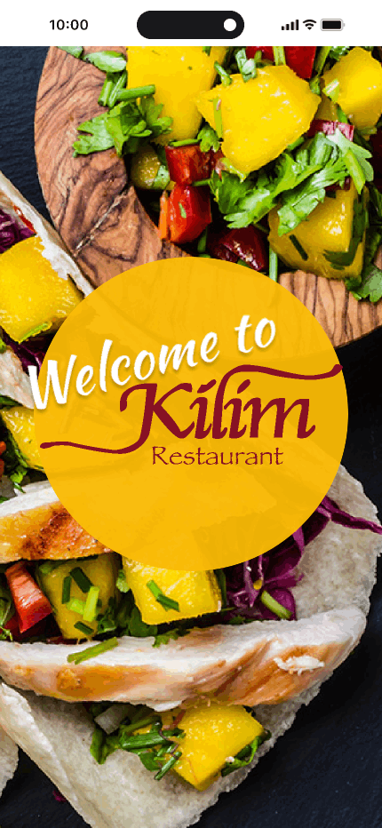
Order, Pay, Enjoy
Enhancing the Customer Experience: Overcoming Pandemic Challenges for Kilim Restaurant
Project duration
September - December 2021
My Responsibilty
-
User interview
-
User journey mapping
-
Ideation
-
Paper prototype
-
High-fidelity prototype
Tools
My Role
Solo UX Designer

Discuss the challenges faced by the restaurant, such as long payment queues and increased delivery requests during the pandemic, leading to capacity strains.
Project Overview
The Problem
Customers, especially busy professionals like Albert and family-oriented individuals like Hannah, face several pain points when interacting with Kilim. These pain points include an incomprehensible menu causing frustration, time-consuming phone orders, long wait times in lines for ordering and payment, and confusion upon the arrival of orders.

The Goal
Create a user-friendly Kilim restaurant app to simplify the ordering process, featuring a clear menu with images for easy decision-making, efficient online ordering, and payment options to reduce wait times. Introduce a real-time order tracking feature to enhance the overall customer experience and cater to the diverse needs of busy professionals and families.


Identified a diverse customer base with varied needs, including busy professionals and family-oriented individuals.
User Diversity
Uncovered widespread frustration among users due to the current menu's lack of clarity and user-friendly design.
Service Name
Recognized a strong desire for efficient ordering processes, particularly during peak hours, emphasizing the need for a streamlined solution.
Service Name
Discovered a willingness among users to embrace technology, especially mobile apps, as a preferred means of enhancing their dining experience.
Service Name
In the initial phase of our UX design process, extensive user research was conducted to gain a comprehensive understanding of Kilim's diverse customer base. This research involved a combination of interviews, surveys, and observational studies to capture valuable insights into the behaviors, preferences, and pain points of our users.
User Research
Pain Points
These pain points serve as the basis for designing a user-friendly app that addresses the specific challenges faced by the restaurant's customers, ultimately enhancing the overall customer experience.


Complex menu
Users find the menu difficult to understand, leading to frustration and indecision.
Wait times in lines
Long queues during peak hours; app for quick orders.
Time-consuming order
Phone orders are slaw, need an efficient App
Order arrival confusion
Uncertain table preparation; app needs real-time tracking.
User Personas


Competitive Audit
This chart compares the Kilim app with three competitors across various features. "✔" indicates a feature present in the respective app, while "✘" denotes its absence. Customize the features based on the specific aspects you want to evaluate.

Lo-Fi Wireframes

User Joury

Lo-Fi Prototype
Hi-Fi Mockups


Hi-Fi Prototype
Usability Testings
I orchestrated two rounds of immersive usability studies. In the initial study, insights gleaned from wireframes to mockups guided the evolution of the design. The subsequent study, employing a high-fidelity prototype, pinpointed specific elements within the mockups that demanded fine-tuning and enhancement.
First Round Key Insights
-
Users prefer a visually appealing and easily navigable menu.
-
Users often prioritize quick and efficient ordering processes.
-
Users appreciate a variety of secure payment options.
-
Users value accurate and real-time order tracking.
Before usability study

After usability study

Secound Round Key Insights
-
Users respond positively to promotions and loyalty programs.
-
Users are more likely to leave feedback if it is quick and convenient.
-
Some users may face challenges with accessibility features.
Before usability study

After usability study


Style Guide
The style guide serves as the foundation for the high-fidelity prototype, encompassing key elements integral to the app's visual identity. It covers Typography, Color, Iconography, and Buttons, ensuring a cohesive and harmonious design language.

Impacts


Design evolution
Usability testing informed the iterative evolution of the app's design, shaping it from wireframes to a polished, user-centric interface.
User interaction
Early identification of potential issues through testing allowed for proactive mitigation, contributing to a smoother development process.
Issue mitigations
Insights from testing led to the optimization of interaction design, streamlining processes and enhancing the overall user experience.
Style guide harmony
Usability testing insights facilitated the effective implementation of the style guide, ensuring cohesion in typography, color, iconography, and buttons for a visually harmonious design.
Lessons & Next Steps
In reflecting on the Kilim app redesign, several key takeaways emerge:
User-Centric Design is Paramount:
-
The success of the Kilim app redesign underscores the importance of prioritizing user-centric design principles. By continuously incorporating user feedback and conducting usability studies, we ensured that every design decision resonated with and catered to the needs of our diverse user base.
Iterative Refinement Drives Success:
-
The iterative nature of the design process, informed by usability testing and continuous refinement, played a pivotal role in the success of the Kilim app. Recognizing that refinement is an ongoing journey ensures that the app remains adaptable to evolving user expectations and technological advancements.
Accessibility is Non-Negotiable:
-
Accessibility considerations are not just a checkbox but a fundamental aspect of creating an inclusive digital experience. Prioritizing accessibility features, such as screen reader compatibility and scalable text, not only meets regulatory standards but also aligns with our commitment to providing an accessible platform for all users.
Consistency and Cohesion Matter:
-
The implementation of a comprehensive style guide ensured visual consistency across the Kilim app. Typography, color schemes, iconography, and buttons work harmoniously to create a seamless and visually appealing experience for users.
Lessons Learned
Next Steps
Looking ahead, the journey for Kilim does not end; rather, it marks the beginning of a continuous commitment to improvement and innovation. The next steps include:
Continuous Usability Monitoring:
-
Implement a system for ongoing usability monitoring, including regular user feedback sessions and periodic usability studies. This ensures that the app remains attuned to evolving user expectations and addresses emerging challenges.
Performance Optimization:
-
Prioritize performance optimization to ensure the app remains fast, responsive, and reliable. Conduct regular audits of the app's technical infrastructure to identify and address any potential bottlenecks.
Security and Data Privacy Enhancements:
-
Stay vigilant on security and data privacy fronts. Regularly assess and enhance security measures to protect user data and maintain compliance with evolving data protection regulations.
User Flow
